Choosing your kitchen colour scheme
Navy or forest green? Warm grey or cool white? When it comes to choosing your kitchen colours, the options can feel endless. At Chisholm Design, we know just how much thought goes into finding that perfect scheme. Those final colour renders we produce? They can take weeks to settle on, and rightly so. It's a big decision, and our job is to make those last steps feel as clear and straightforward as possible.
The kitchen is the heart of the home. It's the room that brings family and friends together, whether it's Friday night dinners, Sunday lunches, or after-school homework sessions. It's the most hard-working room in the house, and it needs to work for you just as much as it needs to look great.
Once the key priorities are ticked off and the final design is in place, we help bring your vision to life with curated mood boards, different metals, textures, fittings, and finishes.

A digital mood board can really help you to refine your choices of colours and finishes
Every kitchen we design is unique, tailored to how our clients use their space. Whether you're after something light and neutral or bold and contemporary, we'll help you land on the right scheme. Our detailed colour renders are an invaluable part of this process – they allow you to truly visualise how your chosen colours will work together before any decisions are final.

A full colour, digital render of a client’s kitchen
Ways to Introduce Colour
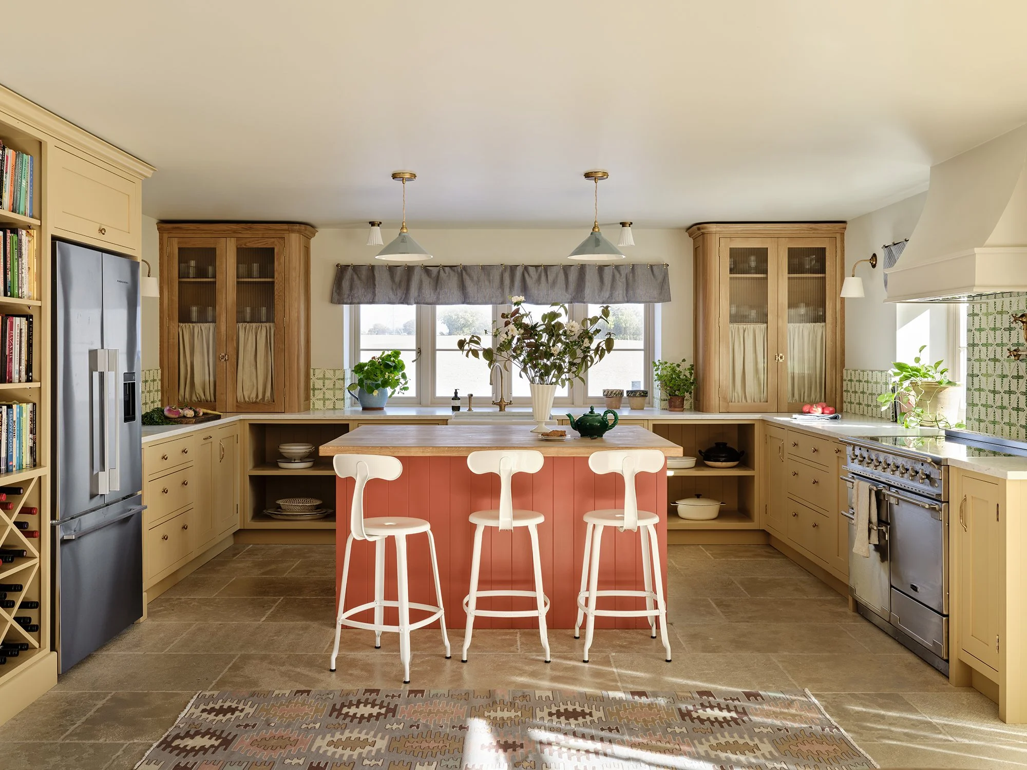
There are so many ways to bring colour into your kitchen: through cabinetry, wall paint, the island, soft furnishings, appliances, tiles, and even the hardware. Over the past year, we've seen a real shift towards bolder choices, with clients opting for rich greens, deep purples, playful pinks, and sunny yellows.
A gorgeous collaboration with Vaughan Design and Development led to this fabulous kitchen painted in Farrow and Ball's Bamboozle No.304 and Atelier Ellis's Sadhika
That said, we do believe it's wise to steer clear of trends that might date quickly, especially when it comes to big-ticket items like worktops and appliances. These choices need to stand the test of time. Choose colours you genuinely love rather than what's simply fashionable right now – a well-chosen classic will always outlast a trendy choice.
Getting the Balance Right
Think about colour balance across the space. A dominant colour with one or two accent tones works far better than too many competing hues. This creates cohesion without feeling flat or monotonous.
If you have an open-plan layout, consider how your kitchen colours will flow with adjoining spaces. The scheme should feel connected to what's visible from the living or dining areas, even if not perfectly matched.
And don't forget about existing fixed elements. If you're keeping existing flooring, windows, or architectural features, your new colours need to work harmoniously with what's staying put. Sometimes the perfect colour on paper won't work with the realities of your space.
Understanding Undertones and Light
Even "neutral" colours have warm or cool undertones that can clash or harmonize with other elements. A warm grey can look quite different next to a cool white worktop, for example. Every paint shade has many different tones, so it's worth taking the time to understand how they interact.
Lighting plays a huge role too. Consider the natural light in your space – is your kitchen north or south-facing? Your chosen colours might shift throughout the day as the sun moves. Artificial lighting can also completely change how a paint colour reads, so think about how your scheme will look under both conditions.
Our Best Testing Tips
Bring it all into your space – paint swatches, worktop samples, flooring, hardware – and see how it looks at different times of day. Make sure you hold your sample in the same plane it will be in real life: horizontally for worktops, vertically for cabinets.

Part of a stunning island worktop in Calacatta Apuana honed marble
Small paint chips can look quite different when applied to large cabinet runs, so if possible, paint a larger board (A3 size or bigger) to get a better sense of how the colour will read across bigger surfaces.
Here's our top tip for worktops: always view full-size samples whenever possible. Small worktop samples can give a completely skewed idea of what the material really looks like. Natural stone, quartz, and other materials often have veining, movement, and colour variation that's only truly visible at scale. What looks subtle on a small sample might be dramatically busy across a three-metre run, or conversely, what looks busy in miniature might be beautifully balanced when seen in full.
The Fun Part
This really is the most exciting part of any kitchen renovation. It's creative, hands-on, and yes, our favourite part too. Recently, a client spent weeks deliberating between three shades of green for their Shaker cabinets. Through our renders and physical samples in their space, they found the perfect mid-tone that worked beautifully with their oak flooring and marble worktops – something that looked completely different on a small paint chip.
Despite the many decisions to be made, our clients can feel confident knowing we're here to guide you through every step. We take the stress out of it, so you can enjoy the process.
Ready to start exploring colours? Book a visit to our showroom in Tilford to see how different schemes work in a real kitchen setting, or get in touch to begin your design journey.

We produce mood boards to help you finalise your choice of finishes - there’s nothing like seeing them all together!